Another month of books, another month of book covers. Here are my favorites from November—an elegant and controlled group, on the whole, to offset the traditional American month of excess.
 Ben Austen, Correction: Parole, Prison, and the Possibility of Change; cover design by Keith Hayes (Flatiron, November 7)
There’s nothing that new about this tonal bisected style for nonfiction, but this version, with the two walking figures, is so clean and energetic that it caught my eye.
 Sigrid Nunez, The Vulnerables; cover design by Lauren Peters-Collaer (Riverhead, November 7)
Another bisected cover, in an entirely different way. I’m a sucker for these vintage illustration collages, I have to say. (Also I’m a poet, apparently.)
 Elaine Feeney, How to Build a Boat; cover design by Zoe Norvell (Biblioasis, November 7)
There is a simple, sad elegance to this cover that I just love.
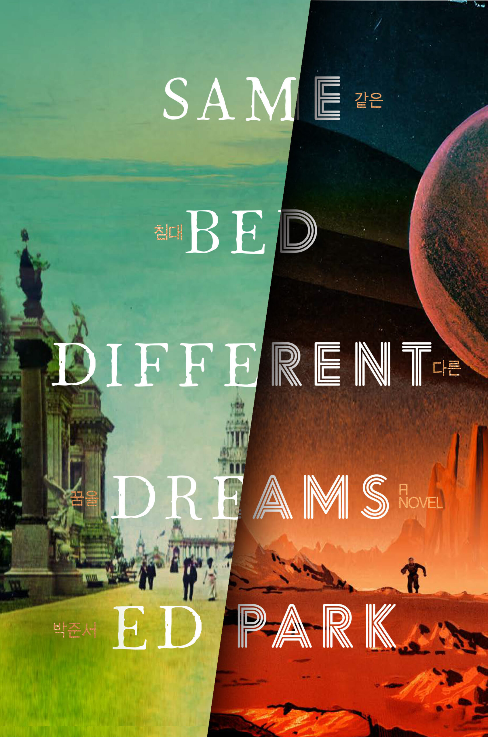 Ed Park, Same Bed Different Dreams; cover design by Will Staehle (Random House, November 7)
“I love how Will Staehle’s cover instantly conveys two of the novel’s dreams—on the left, a ghostly vision of forgotten history (a scene from the 1901 Pan-American Exposition in Buffalo), on the right, a glimpse of fevered possibility (one of my characters is a science fictioneer),” Park told Lit Hub. “The fonts rock. Subtly threaded in gold is the title, translated into the language of my ancestors—Korean—something I never would have dreamed to suggest, but which ties it all together. I asked if my Korean name could be woven in as well, and there it is, three syllables only my family knows. I actually still can’t look at this without crying.” Read more here.
 Tatsuhiko Ishii, tr. Hiroaki Sato, Bathhouse and Other Tanka; cover design by Oliver Munday (New Directions, November 7)
The power of the crop!
 Celina Baljeet Basra, Happy; cover design by Alex Merto (Astra House, November 14)
What do you do with a title like Happy? I guess if you’re Alex Merto, you just lean allllllll the way in.
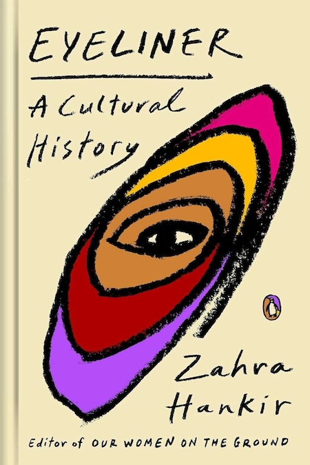 Zahra Hankir, Eyeliner: A Cultural History; cover design by Lynn Buckley (Penguin Books, November 14)
Clearly the correct text treatment, among other things.
 King Young-sook, tr. Janet Hong, At Night He Lifts Weights; cover design by Justin Carder (Transit Books, November 14)
This one is very beautiful, in my opinion, with wonderfully surprising text and color choices.
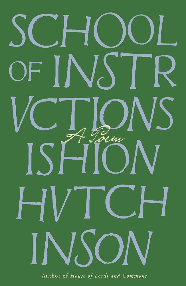 Ishion Hutchinson, School of Instructions: A Poem; cover design by Crisis (FSG, November 21)
I love a good text cover—this one is giving “magical life-changing book that you found in a corner in the library” vibes.
 James W. Jennings, Wings of Red; cover design by House of Thought (Soft Skull, November 21)
What a font, what a mood.








![‘Criminal Record’ Trailer w/ Peter Capaldi and Cush Jumbo [VIDEO] – TVLine ‘Criminal Record’ Trailer w/ Peter Capaldi and Cush Jumbo [VIDEO] – TVLine](https://washingtonweeklytimes.com/wp-content/themes/jnews/assets/img/jeg-empty.png)


